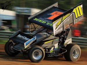
Each week, we field lots of questions on marketing, sponsorship, PR and social media via the blog, email and on the Sponsorship Success Facebook Community. One of the topics that I frequently get questions on is regarding paint schemes.
For example:
- Will my current paint scheme attract or repel future sponsors?
- Should I make my car look ’empty’ so that sponsors see the opportunity?
- Should I let my sponsors determine the color scheme?
- Should I pick a signature color scheme or topic theme (example: non-profit partner) if I don’t have a title sponsor?
Before we get so deep into the paint scheme conversation, I think it’s pivotal to note: your paint scheme should not be your primary focus unless that’s your primary offering. (And, by the way, I don’t think it should be your primary offering when you’re looking to grow from beginner to intermediate and advanced. To go to the next level, you need a dynamic program that engages beyond a logo on a car.)
What I really want you, as a sponsorship seeker or seller, to think about is this: what purpose or role do I want my paint scheme to have in my marketing program as a whole?
The answers to those questions above depend heavily on what you’re selling to marketing partners.
And what you’re selling to marketing partners depends heavily on what your marketing partners’ goals are.
Think about it this way: how would an advertising agency answer similar questions? When a company approaches their marketing program, they have virtually an unlimited number of ways to spend their marketing budget. Should they buy roadside billboards or placemat ads, promoted social media posts or magazine advertisements? Should they sponsor an athlete or throw an event?
Questions about your paint scheme can be answered in the same way that I help companies answer the above questions: what is your program goal?
If you have a local, mass-market product (example: car wash), then getting in front of thousands of automobile drivers each day before they pass your car wash via a billboard would be significantly more effective than advertising that on social media, which they’ll be looking at (hopefully) while they’re not driving.
Comparatively, if you’re looking to appeal to company owners who don’t set their budgets ahead of time and might make a spur-of-the-moment decision to advertise with you when they see your empty car, then putting as little design and as few logos on as possible might be the right plan for you.
If you’re trying to snag more aggressively marketed companies that are more advertising-savvy and want to align with an established brand – and likely have a larger budget, a full paint scheme with companies that they’re comfortable aligning with will be more appealing to them.
If your primary offering is a speaking tour, your paint scheme can be completely unrelated to the marketing partner.
In my opinion, the most successful teams are using the actual race car as a tool, not a placemat to sell ads on. They’re using the car as part of a dynamic program – on autograph cards, at appearances and client events, on social media and more. The amount of logos, empty space or design elements aren’t as important as the overall image and how it fits with the team or driver brand.
And there are plenty of marketing partners that never even utilize the race car in their program.
So, when you’re thinking about next year’s paint scheme, ask yourself this: what’s important to my current marketing partners and the ones I’d like to appeal to in the future? You might save yourself some time and stress…
xo.
Kristin
P.S. Missed the live presentation of our Sponsorship Marketing Webinar: Crafting and Valuing the Perfect Offerings? You can now get it as a recording! Click here for more information.


